As car brands continue to evolve, it's not uncommon for them to refresh their logos to reflect their modern identities. Recently, however, some changes have been so subtle that it’s hard to tell the logo has changed at all.
Take Porsche, for example. The new logo took three years to develop but at a glance is almost identical to the previous version, the gold changing slightly and the background made smoother.
The same goes for Infiniti, where the lines and font have been made thinner, so only those with a keen eye might be able to spot the difference. Or take Opel, where they’ve slightly changed the lightning bolt.
To test whether these minute details are picked up by the average consumer, Vanarama decided to survey 1,000 people. We supplied one correct logo and two incorrect logos of eight manufacturers, and asked respondents to identify the real one.
Top 4 Car Manufacturers With The Most Recognisable Logos
Although we made small changes to the logos, like Porsche, some manufacturers managed to stand out from the crowd, leaving a lasting impression on consumers. Based on the survey results, these brand logos are the most recognisable:
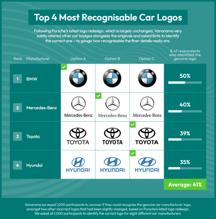
BMW Has The Most Recognised Logo
The BMW logo was easily the most recognised in our study, with half of respondents identifying the genuine logo (Option A).
The iconic circular design, and the blue and white colours that represent the Bavarian flag – a nod to the company’s home – are some of the reasons the logo is so well-known. Although the logo has changed throughout the years, this current logo they use for vehicles has been around since 1997.
Although the German brand updated its logo to a more modern design in 2020, that design is used solely for brand communication. The version we surveyed with is still found on the actual models – perhaps because of how recognisable the symbol has become.
2 In 5 Participants Spotted The Real Mercedes-Benz Logo
Another brand that managed to make a lasting mark on consumers' minds is Mercedes-Benz with two in five respondents recognising the real logo (Option B). While three in five of participants struggled with identifying the logo, the iconic three-pointed star held its ground as a symbol of luxury and prestige. Even with subtle variations, the brand’s emblem retained a level of recognition that many others couldn’t achieve.
The first version of the Mercedes-Benz logo was a gold star on a blue background. This was used from 1909 to 1916. In 1916, the logo was redesigned to include the company name, and it was also changed to a white star on a silver background.
This is the basic design that has been used ever since. The three points of the star represent land, sea, and air – environments the company once believed they would conquer with Mercedes-Benz engines.
Toyota Is The Third Most Recognised Logo
Almost two in five respondents identified the correct Toyota logo (Option C), making it the third most recognised. Interestingly, the current logo is a far cry from the first Toyota logo ever introduced in 1935. It featured a red and white diamond with the company’s name in the middle.
It wasn’t until 1969 that Toyota introduced the three-oval design, which is meant to represent the heart of the customer, the heart of the product and the heart of the company.
The current logo we see today has actually been around since 1989, proving it’s a symbol that’s stood the test of time and why so many respondents were able to recognise it.
Over A Third Of Respondents Recognised The Real Hyundai Logo
The fourth most recognised car logo is Hyundai’s, with over a third of participants identifying the real one (Option C). Hyundai is another car brand that has drastically changed their logo since the first inception. The first logo in 1967 featured a stylised ‘HD’ infront of a car window shape.
In 2003, they brought out the logo that is still being used today, with a stylised ‘H’ in an oval shape. The ‘H’ supposedly represents two people shaking hands to show their commitment to customer service, while the oval represents the company’s global reach.
Car Manufacturers With The Least Recognisable Logos
While some car brands’ logos were in plain sight, there were a few manufacturers whose logos proved to be more elusive for survey participants. Let’s take a look at the brands with least recognisable logos based on the survey results:
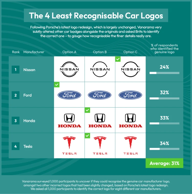
Nissan Has The Least Recognisable Logo With 3 In 4 Unable To Spot The Real Logo
Nissan has found itself at the top of the list of least recognisable car logos, with a staggering 75% (three quarters) of respondents unable to correctly identify the logo (Option C).
Despite the brand’s reputation for innovative designs, with the manufacturer being one of the first to bring out a mass-produced electric car in the Nissan Leaf, the logo has seemed to cause confusion.
Only a quarter of particiapnts could spot the correct logo (24%). Interestingly, more people thought ‘Option A’ was the genuine logo with a third of responses.
The current logo was brought out in 2020, which is perhaps not enough time for consumers to become familiar with.
Ford Is The Second Least Recognised Logo
Surprisingly, Ford, a renowned automaker with a rich history has the second least recognised logo. A whopping 68% of participants couldn’t identify the real logo (Option A). A considerable 42% of respondents thought ‘Option B’ was the correct logo, whereas only 32% spotted the real one. It’s possible that the subtly altered alternatives used in the survey threw off respondents, highlighting the fine line manufacturers might cross when making minute changes to logos, as Porsche did.
Over Two Thirds Couldn’t Spot The Real Honda Logo
Over two thirds (67%) of respondents couldn’t identify the genuine Honda logo (Option B). Although Honda has been around since 1948, the logo is not as identifiable as other car manufacturers in our study. In fact, it’s the third least recognised.
Tesla’s Logo Is The Fourth Least Recognised
Surprisingly, innovative electric vehicle manufacturer Tesla also faced logo recognition hurdles, with 66% of respondents unable to correctly spot its logo (Option B). Despite its modern image and strong association with cutting-edge technology, the subtle edits made to the logo were enough to throw participants off.
Searches For ‘KN cars’ Surged 144% When KIA Launched Its New Logo
On the other side of the spectrum, instead of making subtle changes to your logo, car manufacturers can completely change their logo to the point consumers may not understand who they are anymore. Such as KIA, for example. The manufacturer rebranded in January 2021, with a new logo many thought read ‘KN’.
The year before the new logo’s debut, google searches for ‘KN cars’ were averaging 45 searches a month globally. In January 2021, when the new logo was launched, searches for ‘KN cars’ jumped 144% to 110 searches a month, and searches have steadily increased since, now averaging a whopping 6,600 a month across the globe.
There are significant car manufacturer rebrands that have worked, though. Take Renault – the manufacturer changed its logo to a more geometric diamond in March 2021 and searches for ‘Renault’ jumped 22% that month.
Methodology
Vanarama surveyed 1,000 respondents to determine if they could recognise the genuine car manufacturer logos, alongside two other incorrect, slightly altered logos per brand. We asked all 1,000 participants to identify the correct logo for eight different car manufacturers.
Check out the Vanarama blog for more automotive news, or if you’re looking to upgrade your car, browse our car leasing deals.